Harvest Profit

Harvest Profit is a software company in Fargo, ND. Their products include mobile apps, consulting services, and a subscription-based web app.

My work with Harvest Profit was focused on improving the way their software worked. I did this by creating a comprehensive style guide and reworking functionality with users in mind. Here are some highlights from my time working with them.

Expertise
Design and Interaction

Deliverables
UI and UX

Platform
Web, iOS, Android

Check 'em out
harvestprofit.com
Getting Started Guide

Customers were unsure where to start with our software. This guide was created to address that by helping our users get started. It contains easy to follow instructions describing how they can enter the needed information to get started with the software.

The guide was printed and sent to customers while we worked on an onboarding flow. You can see the full guide here.

Onboarding

After we sent out the onboarding guide, we created this onboarding flow. It was designed to help users enter necessary data as well as connect our software to other farming apps.

Here is a prototype of the onboarding process.

Crop Planner

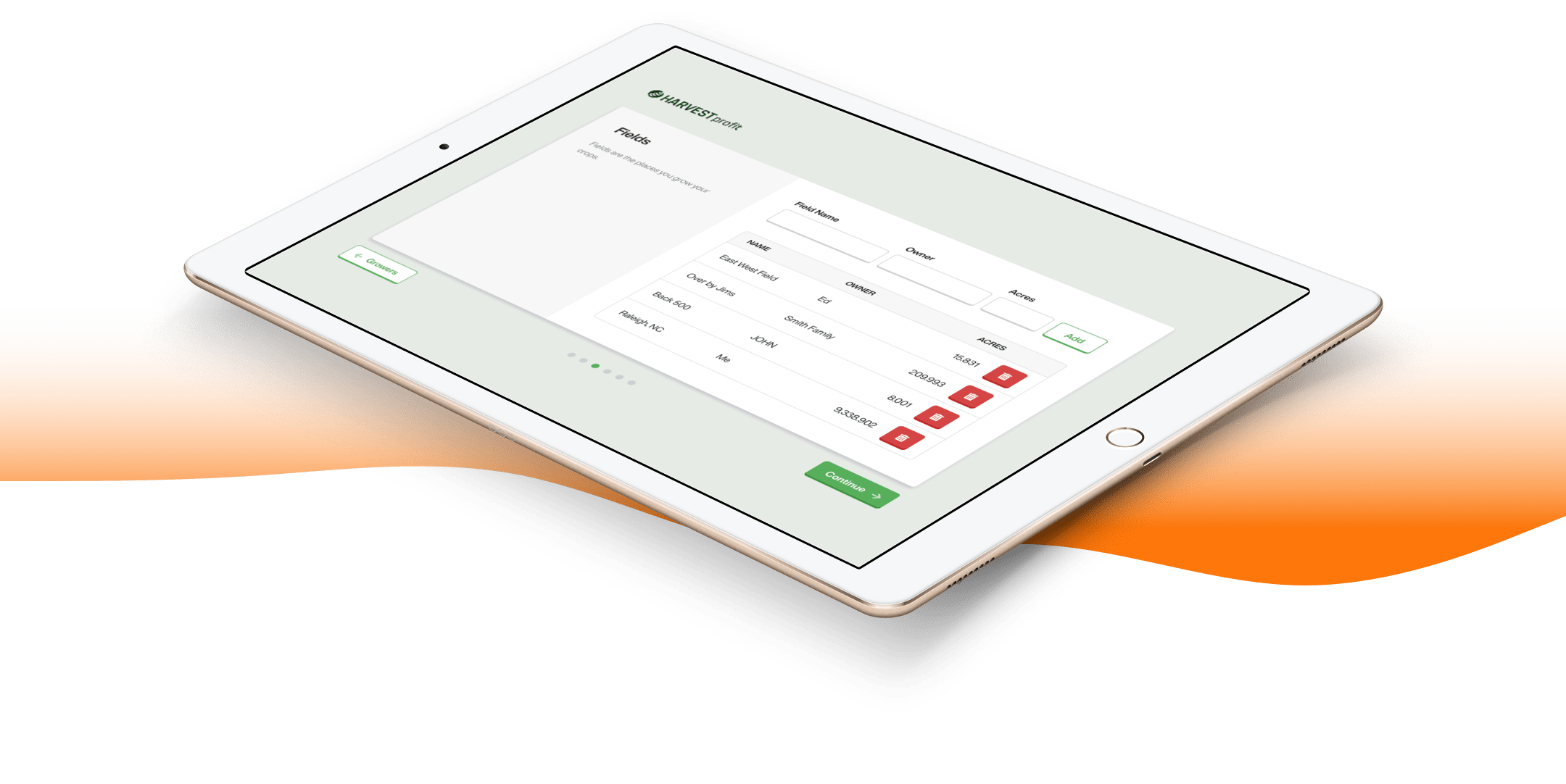
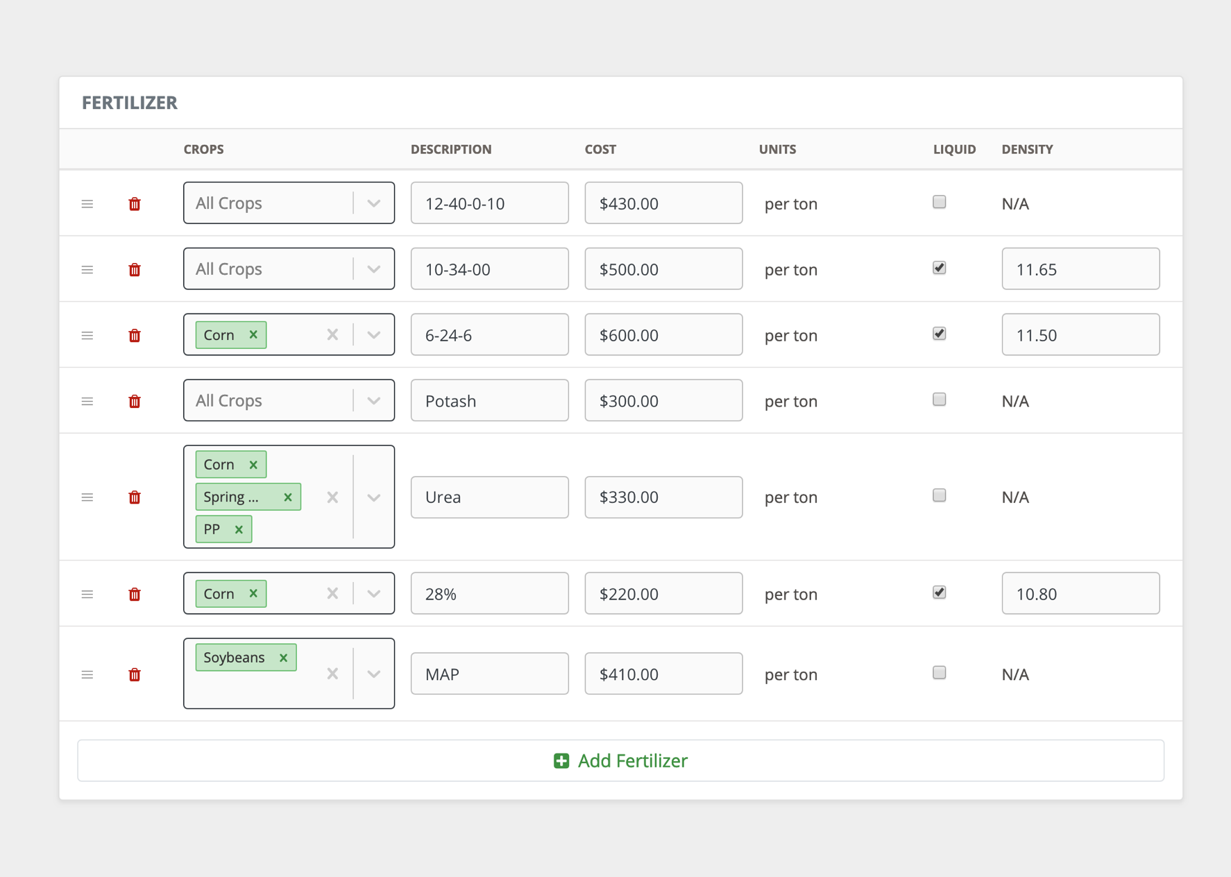
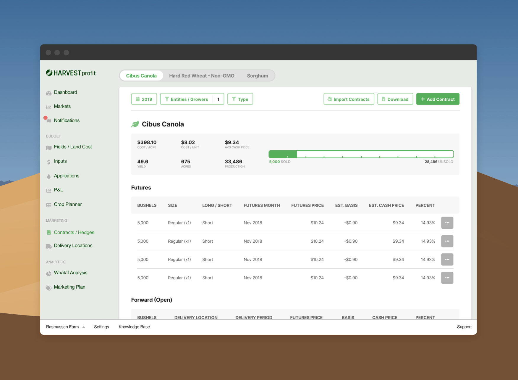
With Harvest Profit's software, farmers track the details of their fields. Each field can contain plantings, each planting crops, and each planting can be subdivided between different farmers or businesses (called "share agreements" in my designs, and "entity splits" on the current page).

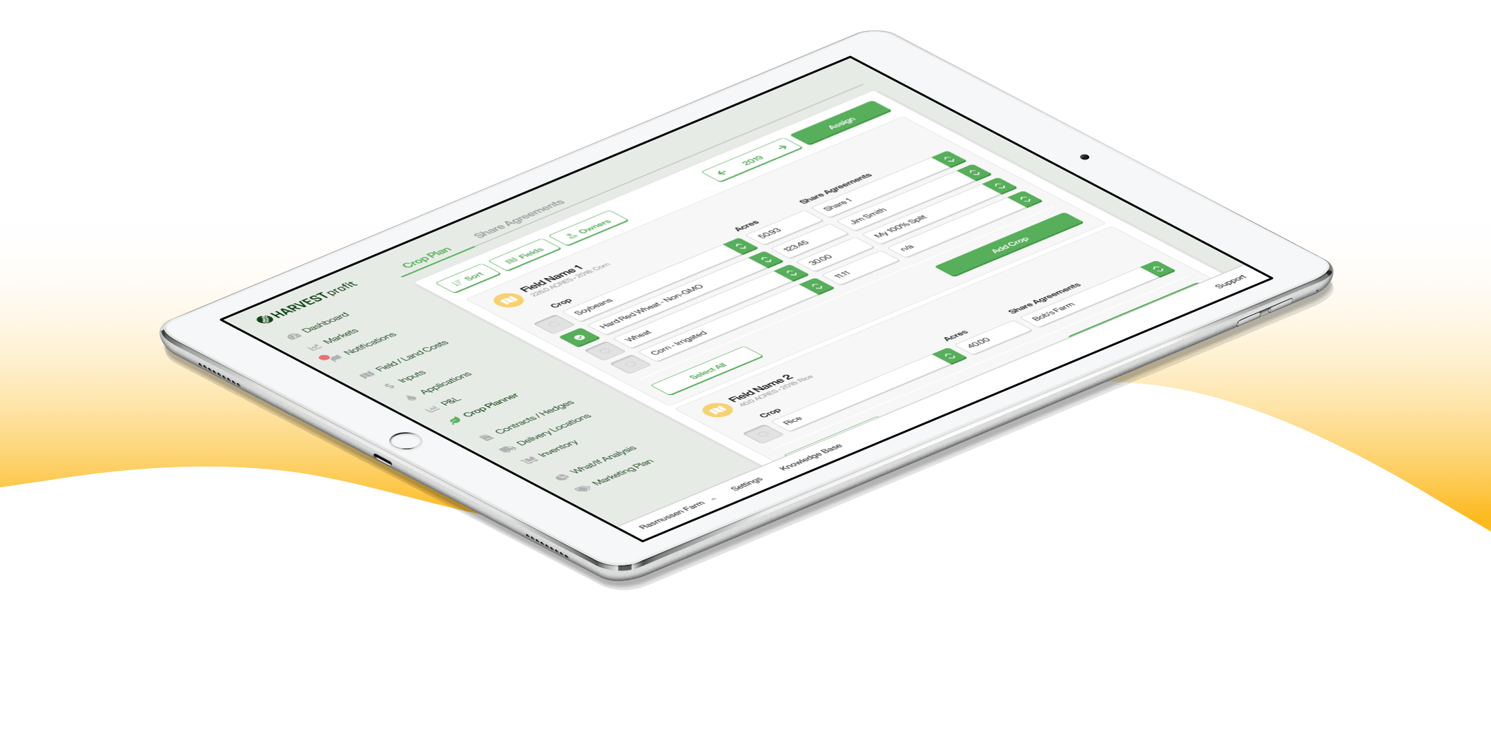
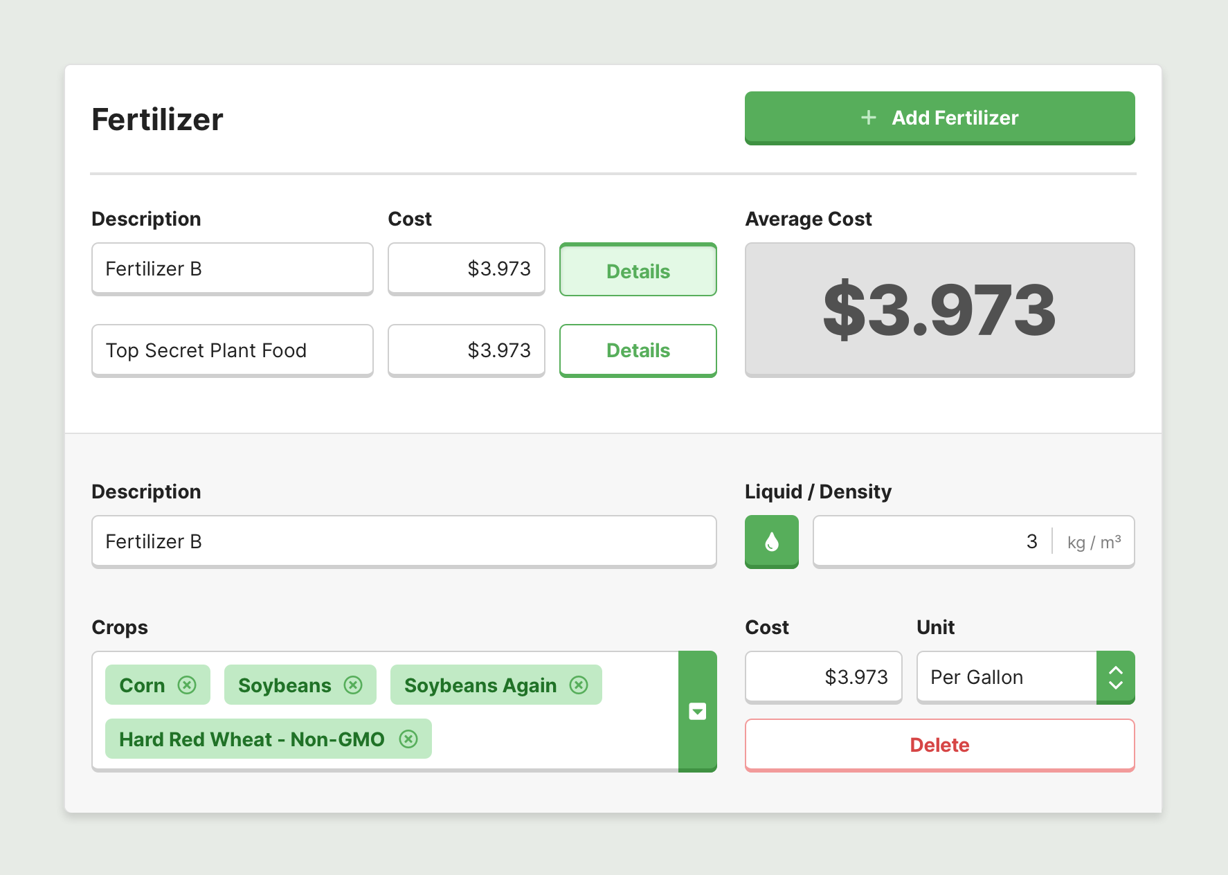
Our users wanted to apply share agreements to multiple fields (e.g., you and your neighbor often share the work on the fields where your properties meet). Our app did not have this functionality, so I got to work brainstorming how to make this process easy. I was reminded of the tags on my computer. I can make a tag, apply it to multiple files, and when I change the tag it changes everywhere. I saw this idea as the perfect solution to our problem and drafted my idea with Sketch. To simplify things, I moved share agreements into their own tab, where users would have the space to fine-tune their share agreements.

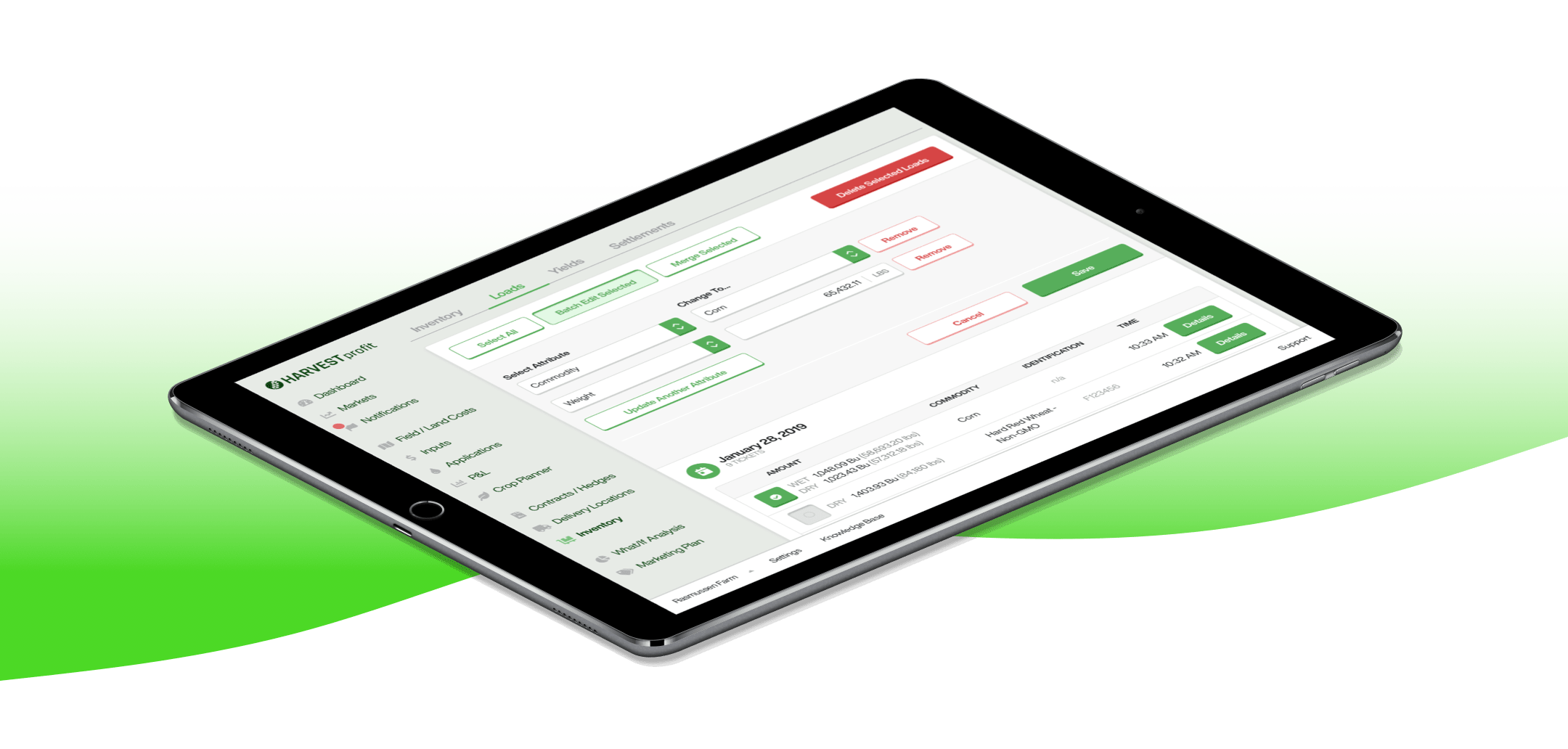
Here is a basic prototype of where the project began and my work.

Inputs

The inputs feature is where you track anything that goes into your business - think seed, pesticides, and fertilizer.

I'm going to do something different for this section, and describe some of my missteps. You can follow along with this prototype of my ideas.

This is the current design, showing the fertilizer group. Each line item is a fertilizer this user added.

  • ✅ Quickly scannable
  • ✅ Good information density
  • ❌ 'Add Fertilizer' and crop picker buttons are all but hidden

And this is my replacement. Boy, am I glad this atrocity didn't get put into production.

  • ❌ Interaction required to see details
  • ❌ Contrast of crops is poor
  • ❌ Radio button denoting liquid is unclear
  • ❌ Will not scale well
  • ✅ Color! Contrast! Right aligned numbers!

In an effort to speed up navigation on the page, I experimented with this shortcut interface.

This idea failed because users can just, you know, scroll down.


Contracts

This was one of the first pages I overhauled (eagle-eyed viewers will notice some less evolved styles here). More subtle changes include translating Engineer-ese to English, like "Export" to "Download".

Here is a clickable preview of the page as it was given to me

This prototype is my first draft for a redesign.


Inventory

This feature helps farmers keep track of every kernel of product on their farm and where it winds up. On this prototype I experimented more than before. Some ideas worked, while others did not, like an accordion-style filter.

"You don't need to know anything about farming to appreciate a highly readable interface", that's what my grandpappy always said. Here is where the page started, and this is the direction I imagined taking it.

Filter options expanded like an accordion, pushing content offscreen and sentencing this idea to the cutting room floor