Subscriptions
One of the biggest projects I worked on was a ground-up replacement of our subscription service. We used a third-party service for customers to subscribe to our products. We dumped the outside company and built a replacement in-house. The in-house build was a sprawling beast of a task, touching nearly every corner of the website and involving every department in the building.
I was responsible for developing the user account part of the project. Our old third-party implementation is on top, mine is below.

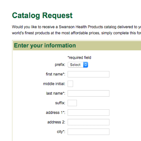
Forms
The biggest change I made to the forms was flipping the way required fields are handled. Previously, required inputs had an asterisk in their label. Instead, optional inputs contain a subtle placeholder. Visually, this tells you there is already something in this box — feel free to skip it.
Other changes include the removal of unneeded inputs as well as colors to show state and create contrast from the white background.
Lots of horizontal scrolling on mobile devices
Probably resulted in a billion dollar increase in revenue
When redesigning the forms, I followed (most of) Nielson Norman's recommendations.
Distinguish optional and required fields. First, eliminate as many optional fields as possible (see the first recommendation above). If some fields truly are necessary, but only apply to a subset of users, don’t make users find out through trial and error. Limit the form to only 1 or 2 optional fields, and clearly label them as optional.
Neilson Norman Group, Website Forms Usability: Top 10 Recommendations
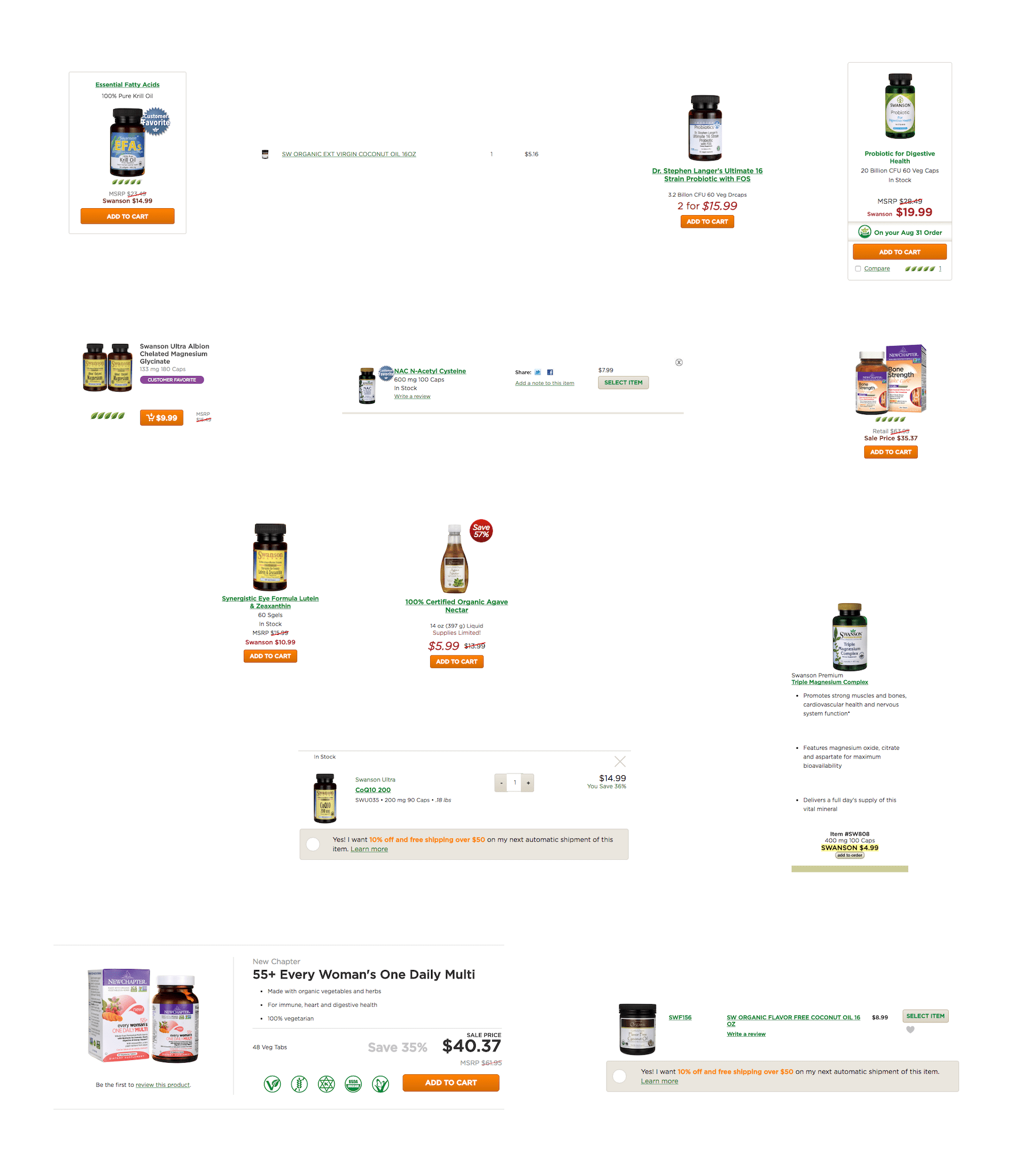
Product Listing Redesign
Products are shown throughout the site in a dizzying number of ways (brace yourself). This mishmash of designs sends an unprofessional message to our customers. Moreso, these burden developers with additional code to maintain and add complexity to our phone support representatives job.
I wanted to change that. I imagined a single design across the site. My new design followed a refreshed brand style, promoted the newly built subscription service, and organized information more professionally.

This will look incredible after you see where it started
Header Concept
As you've noticed, the site is largely devoid of color and more than a little heavy-handed. I wanted to bring a more professional look to the site, starting with the background and header of the site.

This concept was seen as too radical of a change and never made it beyond the drawing board.